
Nina, an AI assistant people actually open
Discovery, concept and UX definition for Nina, a conversational AI assistant built into Israel's 9 insurance app, designed to make people feel capable rather than ignorant.
- Role
- Product Designer (research, concept, UX definition), project lead
- Timeline
- Apr to Sep 2025
- Engagement
- Agency engagement at Firma. Business Design
- Outcomes
- Four concepts from discovery, one selected by the client and built
- A proactive assistant grounded in the user's own policy data
- Conversation and presence patterns defined as a reusable system
9 is an Israeli direct insurer: fully digital, no agents, deliberately cheap. I led this engagement at Firma. Business Design, where the brief was unusually open. Not “design this feature”, but “what feature would change the digital insurance experience in Israel?” I owned the research, the four concepts that came out of it, the UX definition of the one the client chose, and the project itself. Yohai Shalev designed the UI and took the definition further than the spec asked for.
The screens below are in Hebrew, right to left, because that is the product. It is worth saying out loud rather than apologising for: an assistant is almost entirely text, and writing one in a right-to-left language means the bubbles, the reply that starts the task, and the arrow on it all run the other way, around numbers, dates and Latin brand names that do not. Where a screen carries a line the argument depends on, the caption translates it.
The brief had no feature in it
The company had a positioning problem behind the product problem. Its previous brand had been built on distrust of insurance agents: buy direct, skip the middleman. That was differentiating in 2015 and generic by 2025, because by then everyone sold direct. Automation and insurtech had moved the market and the story had stopped doing work.
So the goals were set on three levels before any idea was allowed on the table. Commercially, raise engagement and retention. Perceptually, make “100% digital and cheap” mean something specific again. Substantively, give users real value in areas where the product simply did not help them yet.
Insurance apps have almost no reason to exist
The structural problem is touchpoints. An insurance app has close to none. If nothing bad has happened to you, there is no reason to open it, and if something bad has happened you are not in the mood to enjoy the experience. An annual product produces one moment of contact a year, at renewal, and one moment of contact you dread.
I ran the research against four questions rather than a competitor grid: how do you turn a once-a-year product into continuing value, how do you know what a user needs before they go and Google it, what actually makes an app feel worth opening, and where do outside partnerships create immediate value. We looked at insurers worldwide, cross-checked against the Israeli market, and then deliberately at categories with nothing to do with insurance, because the honest answer to “who solved this well?” was mostly not insurers.
Four concepts, scored in public
Discovery produced four, deliberately spread across a spectrum from “solves a real, nagging problem” to “exists because it is fun”, so the client was choosing a strategy and not just a feature.
The client chose the one at the problem end: an assistant that makes you feel like you have got this. That became Nina.
The insight was not “add AI”
The research kept returning the same feeling, and it was not about insurance. People feel small and stupid at the garage. They do not understand their own car, and they are not sure what their policy actually gives them. They nod along and hope.
That reframed the whole thing. The target was not information delivery, it was competence: an assistant whose job is to make a person feel capable. Which happens to be the hardest thing to fake, because an assistant that answers confidently and wrongly produces the opposite feeling with interest.
Proactive, grounded, and able to finish the job
Three decisions defined the interaction, and each of them is a rejection of the default chatbot.
Nina speaks first. She does not sit behind a “How can I help?” prompt waiting to be interrogated. She opens with something true about your account right now, and she knows what it costs you to ignore it.
She is grounded in your policy, not in a knowledge base. The answers are personal: your policy, your history, your renewal, your discount. A generic answer about insurance is worse than no answer, because it is confidently unhelpful.
She can finish the task in the conversation. The reply is not a link to a form. It is a button that does the thing.
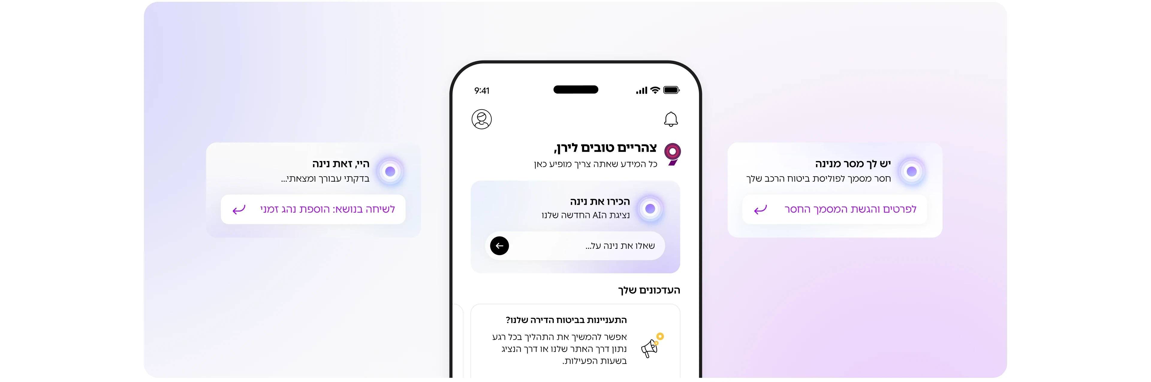
- “Good afternoon, Liran. Everything you need is here.” The screen is addressed to a person, not to an account.
- “Hi, this is Nina. I checked for you and found…” The reply underneath is not a link but the task: “chat about adding a temporary driver”.
- “You have a message from Nina: a document is missing from your car insurance policy”, and one tap to “submit the missing document”.
- “Meet Nina, our new AI representative”, with an open field: “ask Nina about…” The one place she waits to be asked rather than speaking first.
That single exchange is the whole product argument. Nina notices that seven days remain to upload documents before the discount is lost, says so before you have thought about it, and offers to start the upload right there. Nobody had to open the app, remember the deadline, find the right screen, or feel stupid.
Designing a presence, not a chat window
Nina needed a body. Chat UI alone would have made her a support feature, and the goal was a companion in the product.
She is an ambient orb: a soft gradient with designed states rather than a static avatar. The transition matters more than the shape. The orb lives small in the bottom navigation, and when you call her it rises out of the tab bar and grows into the screen, so she arrives from inside the app rather than appearing on top of it. She listens, thinks and answers in the same form, which is what lets voice and text feel like one assistant instead of two features.
Nina is not the product’s other voice
The app also has a nine-step onboarding journey with its own messaging, and the two were colliding. We separated them explicitly: the nine steps tell you where you are in a process, Nina tells you what to do about it. Different jobs, different tone, different triggers, written down as a rule rather than left to whoever drafted the next screen.
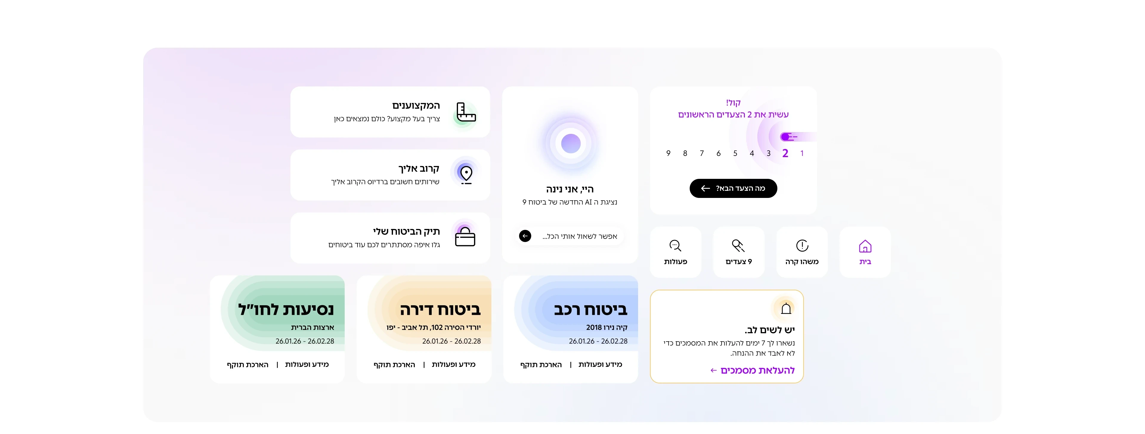
- The nine steps: “nice, you have done the first 2 steps”, a counter running 9 down to 1, and one button, “what is the next step?” It tells you where you are in a process.
- “Hi, I am Nina, the new AI representative of 9 insurance. You can ask me anything.” Different job, different voice, same screen.
- “Note: seven days left to upload your documents so you do not lose the discount”, and the action below it is “upload documents”. This is the example the section above describes.
- The policies themselves: car, home and travel, each with its dates and cover. The reference layer Nina answers from.
That is the part that scales. A named assistant with an undefined voice becomes inconsistent the moment more than one person writes for it, and inconsistency in an assistant reads as unreliability.
What I would push harder on
Nina shipped as chat with voice input rather than a full voice interface, which was the right call for 2025 and for the app’s actual usage, but the interesting design problems in voice are the ones we did not have to solve: repair when the assistant mishears, and how a proactive assistant behaves when it is wrong. We wrote the confident path well. The recovery path deserved the same attention.
The other honest note is measurement. The concept was scored against expected engagement before it was built, and the design decisions above are arguments, not results. If I ran it again I would have instrumented the proactive message from day one, because “does an assistant that speaks first get opened more than one that waits?” is the single question the whole concept rests on, and it is answerable.