'%3e%3cpath%20fill-rule='evenodd'%20clip-rule='evenodd'%20d='M31.9887%2015.5627L31.9644%2014.9809C31.9612%2014.931%2031.9567%2014.8817%2031.9529%2014.8312H31.1593H24.1436C20.5353%2014.8312%2019.4774%2012.6494%2015.8236%2012.6494C12.1705%2012.6494%2011.1855%2014.8312%207.50424%2014.8312H0.0872841H0.0469641C0.0456841%2014.8523%200.0437641%2014.8728%200.0418441%2014.8939C0.0316041%2015.0501%200.0220041%2015.2062%200.0156041%2015.3637C0.00792414%2015.5755%200.000244141%2015.7867%200.000244141%2015.9998C0.000244141%2016.1317%200.00664414%2016.2609%200.00984414%2016.3915H31.99C31.9919%2016.3224%2031.9945%2016.2539%2031.9951%2016.1848L31.9977%2015.9998L31.9983%2015.9403C31.9977%2015.8136%2031.9919%2015.6881%2031.9887%2015.5627Z'%20fill='white'/%3e%3c/g%3e%3cg%20clip-path='url(%23clip1_138_81269)'%3e%3cpath%20fill-rule='evenodd'%20clip-rule='evenodd'%20d='M16%200C7.53239%200%200.601436%206.5408%200%2014.8314H0.0404381H7.47976C11.1718%2014.8314%2012.159%2012.6496%2015.8228%2012.6496C19.4879%2012.6496%2020.549%2014.8314%2024.1672%2014.8314H31.2034H32C31.3992%206.5408%2024.4676%200%2016%200Z'%20fill='url(%23paint0_linear_138_81269)'/%3e%3c/g%3e%3cpath%20d='M37.36%2021.5V10.204H39.248V19.788H43.408V21.5H37.36ZM48.1584%2021.708C45.8224%2021.708%2044.2704%2020.06%2044.2704%2017.468C44.2704%2014.796%2045.9184%2012.988%2048.3504%2012.988C50.6704%2012.988%2052.2064%2014.62%2052.2064%2017.228C52.2064%2017.452%2052.2064%2017.676%2052.1744%2017.9H45.9824C46.1104%2019.324%2046.9424%2020.204%2048.2224%2020.204C49.1504%2020.204%2049.8544%2019.756%2050.1584%2019.004H51.9504C51.3904%2020.652%2050.0304%2021.708%2048.1584%2021.708ZM46.0144%2016.572H50.4624C50.3504%2015.292%2049.5024%2014.492%2048.2544%2014.492C46.9744%2014.492%2046.1424%2015.308%2046.0144%2016.572ZM57.3174%2021.724C55.2214%2021.724%2053.8134%2020.38%2053.8134%2018.22V13.228H55.6374V18.188C55.6374%2019.372%2056.3574%2020.092%2057.4134%2020.092C58.4854%2020.092%2059.1894%2019.34%2059.1894%2018.156V13.228H61.0134V18.012C61.0134%2020.236%2059.5254%2021.724%2057.3174%2021.724ZM63.1164%2021.5V13.228H64.1244L65.0524%2014.236C65.5324%2013.436%2066.3324%2013.004%2067.3724%2013.004C68.6204%2013.004%2069.5804%2013.628%2070.0284%2014.716C70.4124%2013.644%2071.4204%2013.004%2072.7164%2013.004C74.4924%2013.004%2075.6444%2014.252%2075.6444%2016.204V21.5H73.8204V16.508C73.8204%2015.324%2073.1324%2014.556%2072.0764%2014.556C70.9724%2014.556%2070.2844%2015.468%2070.2844%2016.956V21.5H68.4764V16.508C68.4764%2015.324%2067.7884%2014.556%2066.7324%2014.556C65.6124%2014.556%2064.9404%2015.468%2064.9404%2016.956V21.5H63.1164ZM77.8253%2021.5V13.228H79.6813V21.5H77.8253ZM77.7933%2011.756V10.108H79.7133V11.756H77.7933Z'%20fill='%23070762'/%3e%3cdefs%3e%3clinearGradient%20id='paint0_linear_138_81269'%20x1='6.67719'%20y1='3.68062'%20x2='6.67719'%20y2='12.3225'%20gradientUnits='userSpaceOnUse'%3e%3cstop%20stop-color='%236EA6FD'/%3e%3cstop%20offset='1'%20stop-color='%23126CF9'/%3e%3c/linearGradient%3e%3cclipPath%20id='clip0_138_81269'%3e%3crect%20width='31.9981'%20height='3.74208'%20fill='white'%20transform='translate(0.000244141%2012.6494)'/%3e%3c/clipPath%3e%3cclipPath%20id='clip1_138_81269'%3e%3crect%20width='32'%20height='14.8314'%20fill='white'/%3e%3c/clipPath%3e%3c/defs%3e%3c/svg%3e)
26% conversion on fully digital loans
A mobile-first, fully digital multi-loan process for Israel's largest bank: 26% conversion and 420+ approvals a day.
- Role
- Product Designer
- Timeline
- 2022 to 2025
- Engagement
- In-house product team (via Firma. Business Design)
- Outcomes
- 26% conversion on a fully digital loan process
- +27% fixed-interest selection through choice framing
- 420+ loans approved daily
Leumi is Israel’s largest bank. Its in-app loan process now approves more than 420 loans a day with no human intervention, at a 26% total conversion rate. Borrowing that used to require a branch visit or a phone call is now something customers complete on their phones, end to end.
I worked on this embedded via Firma. Business Design in Leumi’s product team, alongside a lead product manager for loans, two additional product managers, and a UI designer who owned the visual language. My side of the work: user research, defining the product flows, and designing the screens and prototypes for the whole journey, inside a regulated environment where every sentence on screen gets legal scrutiny.
The conversion problem
The research phase (surveys, service-center observations, interviews, competitor analysis) surfaced an uncomfortable picture. 71% of customers who had taken a loan had never used the bank’s digital channels for it. The number one reason, named by 47% of participants, was the belief that a human banker would offer a better deal. Users said they could not find clear information about interest rates or what the total repayment would actually be.
So the challenge was double: make borrowing feel clear and even a little friendly, and at the same time present the bank’s full range of loan products transparently enough that people stopped assuming the branch had a secret better offer.
The bet, written down first
The 47% was the number that mattered, and it is not an information problem. People were not saying the app was unclear, they were saying they did not believe it. So the claim the whole redesign rests on was written before anything was drawn: if the app shows the full range of offers side by side and states plainly what each one costs, customers stop assuming a banker would do better, and enough of them finish on their own that the branch is no longer needed for this product.
That is a claim about belief rather than about interface, and it decided the shape of the flow: comparison first, application second. It also decided what to count. Not satisfaction, but completion rate, conversion, and how the mix of products chosen in the app compares to the mix chosen in branch. If the belief was really the blocker, that mix should move.
One flow, three kinds of loans
The redesign merged three previously separate cases into a single process: a standard single loan, multiple smaller loans combined into one larger offer, and balloon loans, which had never been available in the app at all. One journey, with the complexity absorbed by the flow instead of the user.
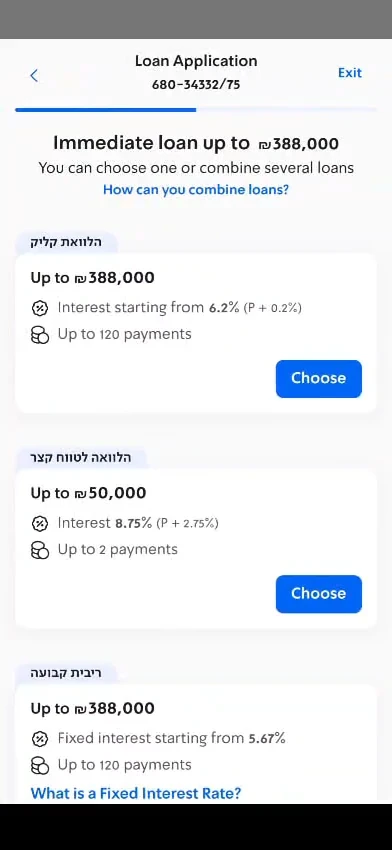
The design system had no way to compare loan offers, so I designed a new comparison component for it: variable-rate offers sorted from cheapest, with the fixed-rate option presented alongside. Each card states its rate and payment count, and the fixed-rate card carries a plain-language explainer link right at the decision point.
Worth being exact about what that 27% is: the digital product mix compared against the branch mix over the same period, not a controlled split test. It is strong enough to act on and not strong enough to call causal on its own, and the honest reading is that the ordering, the plain rates and the explainer moved it together, with no way to separate their contributions after the fact.
Testing reshaped the flow in smaller ways too. Users eligible for only one loan found the stepped process needlessly heavy, so a bottom sheet now appears before the proposal, telling them they can raise the amount up to their personal maximum and then getting out of the way. Animated illustrations, led by a coin mascot, run through the process to soften what is otherwise a tense financial moment.
Outcomes
- 26% total conversion on the fully digital process
- 27% more customers choosing fixed-interest loans digitally than in-branch
- 420+ loans approved daily since launch, fully digital, with no human intervention
What I took from it
The bet held, and the part of it I underestimated was how much of the work was arithmetic that the customer never sees. People did not need to be persuaded that the app was convenient. They needed to be able to check, in the app, the thing they would otherwise have gone to a branch to check. Once the comparison was there and the rates were stated without hedging, the convenience argument made itself.
The thing I would do differently is instrumentation. The choice screen was the single most interesting surface in the product, and it shipped without the ability to test a variant against it. Comparing the digital mix to the branch mix afterwards is the weakest form of the evidence I could have had: it tells you something moved and leaves you arguing about why. Deciding what to count before designing was right, and it was not the same as being able to measure it properly, which is a distinction I got wrong here and have not made again.